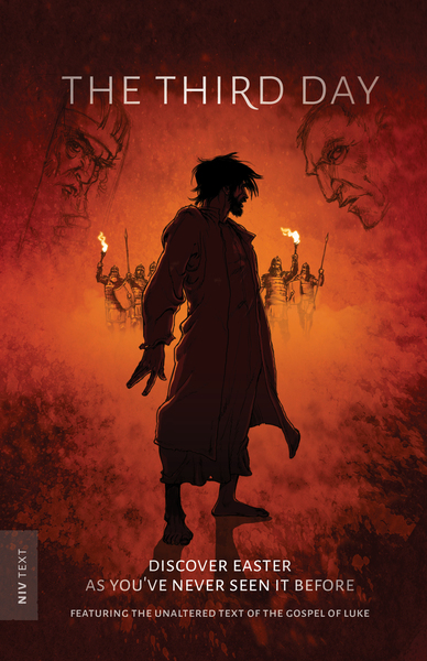
Just under a year ago, we published The Third Day. It was a new kind of book for us, as it is a graphic realisation of the last three chapters of Luke's Gospel. We are still immensely proud of the publication.
This year, in time for Easter, we've given the cover a fresh new look, we've added a spine and upraged the paper which really helps the illustrations shine out.
Of course there are lots of graphic Bibles out there - but how is this different? In three significant ways:
1. Who it's aimed at
Strangely, The Third Day started life as a tract. We were concerned that many people are more visual learners who do not respond well to a booklet filled with words. And we are increasingly aware that many people do not have any real grasp of the facts of the Easter story. So we wanted to explore producing a short visual guide to the events and meaning of Easter - so we started thinking about drawing something, rather than writing something.
But the target was always Older teens and Adults. For those who are more literary, there is a feeling that illustrations and comic books are for children, and something you grow out of. But the reality is that there are a huge number of adults who read graphic novels, comic strips and enjoy animations as much as reading and "live action" films. Check out the size of the graphic novel section of your local library sometime.
As we thought about the tract, it became clear that we needed to do something larger and more encompassing - so the idea for The Third Day was born.
2. Gritty artwork
We were blessed to have in Anglo-Dutch illustrator Alex Webb-Peploe and in-house Head of Design André Parker two very gifted Christian thinkers and artists at the heart of this project. As we sat down to talk, it became clear that the graphic Bibles available were largely aimed at children and younger teens. They tended to have bright primary colours, and to play it safe in terms of how they depicted Jesus - reverting to a well-trodden look and feel. Everything looked very clean!
So we wanted to produce artwork that had more of a gritty realism to it - the night scenes not brightly lit, but with the kind of light you would have from oil lamps. And we wanted to have dusty roads, and to "see the dirt under people's fingernails", as Alex said. The result is something that is much darker and bolder. The artwork itself is both striking at first glance, but also rich in texture - meaning that you can return to it again and again and get more out of it.
3. The Story
The other issue with many graphic Bibles is that they are "storified". In other words, they are a retelling of the story, rather than the Bible story itself. At The Good Book Company, we're concerned to let the Bible speak for itself, so we set ourselves the task of producing this with just the Bible text itself. All the captions, speech bubbles and rubrics are straight from the Bible version we used (NIV in the UK, and HCSB for the US). Nothing more. And then set our illustrators the task of realising visually the descriptive passages from Luke 22-24.
Illustrator Alex says:
"We all bring a myriad of cultural influences to everything we do,see and interact with. For example, even when reading the Bible we can be visualising sweeping Hollywood settings with voiceover and soundtrack. So there were many times as we were developing that when we had to just stop, clear our heads and approach Luke's text with a blank canvas. For example - what did the angels at the resurrection look like? And how do we depict visually the haunting words of Luke 22:3, 'Then Satan entered Judas…'. It was a challenge, but ultimately refreshing; and our hope is that this is an honest depiction of what Luke recorded all those years ago."